Apr 18, 2024
How To Read a Stock Chart: A Beginner’s Guide + Stock Chart Glossary

Reading stock charts might feel intimidating if you’ve never looked at one before. Don’t be scared away, it’s simply a visual representation of data.
In fact, reading stock charts might feel like reading another language. In a way, it is—but once you understand the basics, it’s a lot simpler to become fluent than you might think.
A stock chart is a graph that shows the price of a stock over a certain period of time. It allows you to gauge a stock’s current and past performance and forecast how it might perform in the future. Knowing how to read stock charts is a great skill to have in your arsenal when it comes to choosing the right stocks and making more informed investing decisions overall.
In this post, we’ll walk through stock chart basics, compare three different types, and explain how each displays an investment’s performance.
Keep reading to learn how to read a stock chart.
1. Understand the anatomy of a stock chart
Learning how to read stock charts becomes easier when you break it down into individual parts. Let’s use Alphabet’s (aka Google, GOOG) stock chart as an example, taken from Google Finance.
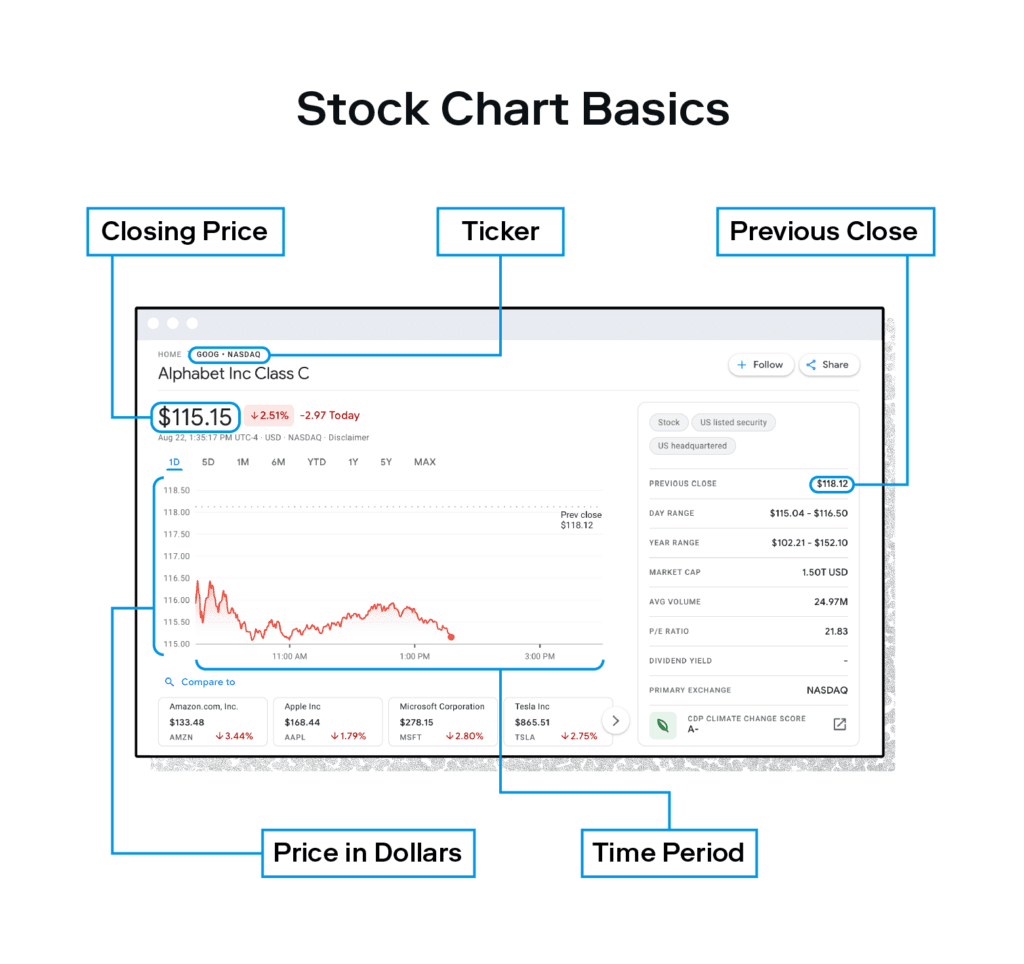
The chart above is filtered by one day, so it’s showing Alphabet’s stock performance over the course of August 22, 2022. You can filter the time shown by days, months, or years.
Here are some basic stock chart elements to know and notice at first glance:
Ticker: you can find any company’s stock chart by searching the company’s ticker—the string of letters shown next to the company name, “GOOG” in Alphabet’s case.
Current price: the current price is the last price a stock was traded for during regular trading hours—9:30 a.m. to 4 p.m. Eastern Time. After trading hours the price will reflect the closing price at the close of the last trading day. Here we see the current price is $115.15, down 2.51% since the markets opened at 9:30 am ET on August 22.
Previous close: this is the closing price of the previous trading day. Here we see the stock price was $118.12 at the market close on August 21.
Y-axis: the vertical axis shows prices in dollars.
X-axis: the horizontal axis shows the length of time for your chosen period.
2. Grasp basic terms on a stock chart
In addition to the chart line, here are some key terms to know when learning how to read stock charts:
Open, high, and low: the open is the price a stock trades for at the beginning of the day, and the high and low are the highest and lowest prices a stock trades for during those hours.
Previous close: the closing price of the previous trading day.
Market cap (market capitalization): this is a measure of a company’s value based on their total shares of stock, found by multiplying the most recent share price by the number of total outstanding shares.
P/E ratio (price-to-earnings ratio): this is a measure of a company’s value used to gauge whether a stock is over- or undervalued, expressed as a ratio between a company’s stock price and its earnings.
Dividend yield: this is the amount paid to an investor in dividends, expressed as a percentage of the stock price.
52-week range: this is the highest and lowest price a stock has traded for in the past year (or 52 weeks).
Once you’ve grasped the basics outlined above, you’ll eventually want to understand the additional terms below. You’ll likely run into them when you move onto more advanced charts, and they provide helpful context when it comes to knowing how to read stock numbers.
Bid and ask price: the bid is the highest price an investor is willing to pay for a share of stock. The ask is the lowest price an investor is willing to sell a share of stock for. A smaller spread is generally seen for stock shares with high trading activity—meaning there are a lot of buyers and sellers.
Volume and average volume: volume tells you the number of shares that are currently being traded that day. The average volume is just what it sounds like—the average number of shares that were traded during a day.
EPS (TTM) and earnings date: short for earnings per share (EPS) for the last year, or “trailing 12 months” (TTM), this is found by dividing a company’s net profit by their total number of shares of stock. The resulting number helps investors gauge a company’s profitability. The higher the EPS, the more investors are willing to pay for that company’s shares.
Ex-dividend date: this is a deadline for investors buying shares of stock from a company. If you purchase a stock on or after the ex-dividend date, you won’t receive dividends for that period.
Beta: this is a numerical value used to measure how risky a stock is based on the overall market. Betas greater than one indicate a more volatile stock for a set period of time, while the inverse is true for betas below one.
One-year target estimate: this represents an estimate of a stock’s price in one year, based on an average found by several analysts. The keyword here is estimate—while it can be a helpful gauge, it’s ultimately just a forecast and could swing in another direction.
Take a look at how these stock chart terms are applied across different types of stock charts below.
3. Know the different types of stock charts
If you’ve just begun learning how to read stock charts, line charts such as Alphabet’s above are akin to swimming in the shallow end of the pool—they’re great for beginners. That said, there are other types of charts that provide a more in-depth look at stock prices and performance.
Line chart
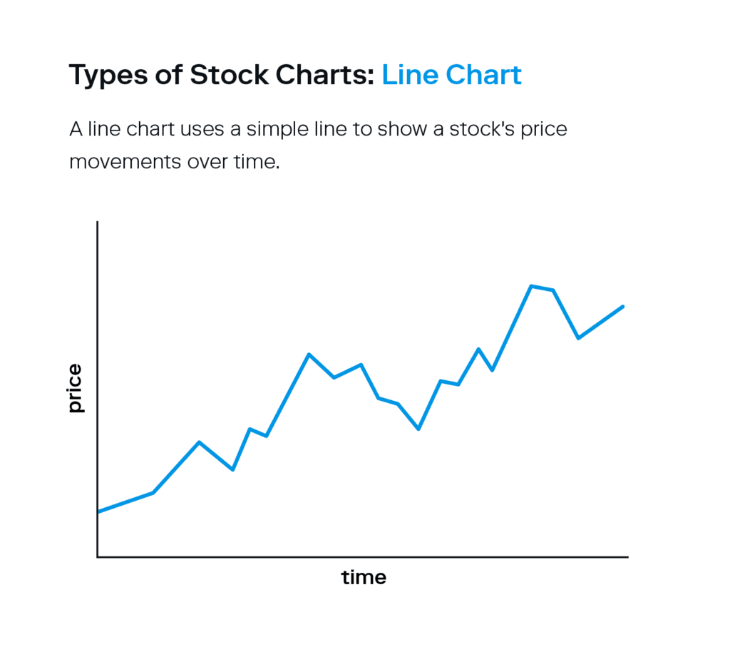
A line chart is the most common type of stock chart. It uses a simple line to represent a stock’s price movements over time and displays the closing price for each time period.
Bar chart
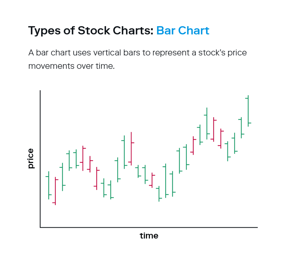
While a line chart shows just the closing price for a set period of time, both bar and candlestick charts also show the open, high, and low in addition to the closing price.
A bar chart uses vertical bars instead of lines to represent a stock’s price, which is often color-coded like the example above. They also have vertical lines with short horizontal lines protruding from each side.
The top of the bar represents the high, and the bottom represents the low.
The short horizontal line protruding on the left indicates the opening price, and the one on the right shows the closing price.
Bar charts allow you to gauge stock trends and price volatility with slightly more precision than a line chart.
Candlestick chart
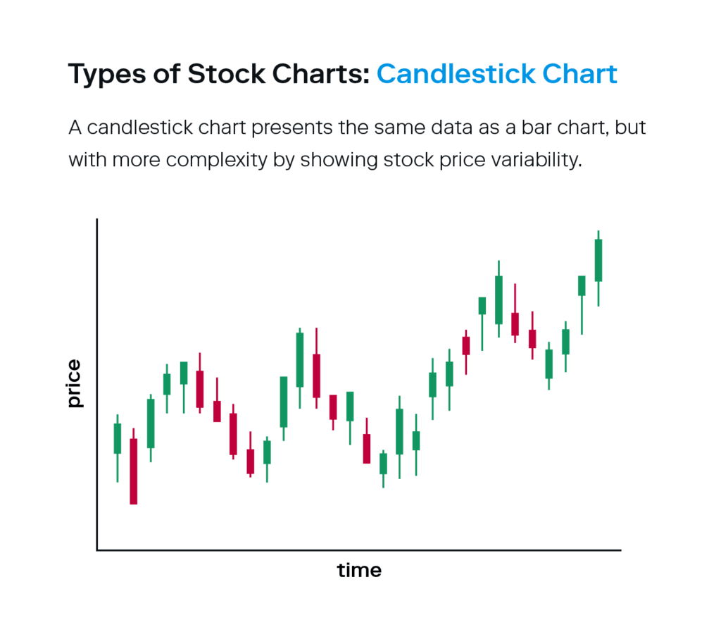
A candlestick chart presents the same data as a bar chart, but with more complexity. In short, candlestick charts show stock price variability from the market open to close.
The body of the candle expresses the open and close prices.
The small lines above and below the body, or the wicks, represent the high and low prices.
The colors of the candlestick indicate if a stock price closed above or below its opening level—green means the stock increased in value, and red indicates the stock decreased in value. These colors are helpful in getting a fuller view of a stock’s performance.
All three types of stock charts are widely used—the one you use is ultimately a matter of preference.
4. Finally, analyze the stock trends
Reading stock charts gets easier with practice, and there are a few helpful points to keep in mind when analyzing stock trends, otherwise known as “technical analysis.” The end goal is to not only understand the patterns you see, but also further investigate their movements to predict future performance.
Here are some technical analysis basics to keep in mind when learning to read stock charts:
Pay attention to trend lines
Trend lines show the general direction a stock’s price is moving. They’re helpful in assessing price movements because it’s widely assumed that a stock will generally continue in the same direction it’s been going. If a stock chart shows an upward-moving trend line, investors might anticipate that it will continue to rise. A stock chart with a downward-moving trend line might indicate that it will continue to fall.
Keep in mind that trend lines rarely move in one direction constantly—swings and fluctuations are normal. Instead, you want to assess the overall trend.
Identify support and resistance levels
In addition to trend lines, investors can also draw lines to connect highs and lows, known as support and resistance levels. These are the levels a stock stays within over a period of time, and investors use them to help gauge the right time to buy or sell their shares.
A level of support shows a price a stock is unlikely to drop below.
A level of resistance shows a price a stock is unlikely to go above.
If a stock breaks through support or resistance, it can be a signal to investors to enter or exit the market. If it breaks through resistance, an investor might believe there’s a good chance the stock will continue to rise, so broken resistance can indicate a good time to enter. If a stock falls past a support area, it may continue to fall, which could indicate a good time to exit.
When analyzing stock charts, remember that trend lines can look different depending on the period of time you’re viewing on the chart. You might see an upward trend line indicating a stock price is rising, but be sure to look at a longer time horizon (at least a year) to get a fuller picture of its performance. A short-term rise could be an outstanding blip in what’s actually an overall downward trend.
Understand trading volumes
The small vertical lines you’ll find at the bottom of most stock charts show the volume at which the stock is traded. While you shouldn’t base your trading decisions on volume alone, it’s helpful to consider. Volume will often increase when major news about a company is released—good or bad. Higher volumes are also associated with more trading activity, indicating you’ll have an easier time buying or selling a share quickly.
Learning to read stock charts might feel confusing, but it’s more simple than you’d think once you know what to look for. Remember to view stock charts relative to your personal time horizon. A chart for a one-day time period isn’t all that helpful if you’re planning to stay invested for the next few decades.
If you’re looking for extra support, consider turning to a platform like Stash that can automatically save or invest money for you.

Investing made easy.
Start today with any dollar amount.

Written by
Team Stash
We want to turn money into a source of hope and opportunity. We teach people how to build good habits, save more and make it easy and affordable to get started investing. So far, we’ve helped over 6 million people create a more secure financial future with our expert advice and award winning investing app.
Related articles
investing
Jun 18, 2026
Best Index Funds for Beginners and How to Pick One
investing
Jun 10, 2026
What Is an Index Fund? A Complete Beginner's Guide

investing
Jun 04, 2026
What Is Quantum Computing? An Investor’s 2026 Guide
investing
Jun 03, 2026
What Is an IPO? How It Works for Everyday Investors
investing
Jan 13, 2026
FAQ: Personal Portfolio
investing
Jan 05, 2026
Why did the price I bought or sold my investments at change? What are Trading Windows?
By using this website you agree to our Terms of Use and Privacy Policy. To begin investing on Stash, you must be approved from an account verification perspective and open a brokerage account.